
This is part 2 of the series “Send Power BI Report in Email using Power Automate”. In this post, we will create a simple power bi report. We will try to make this process completely automated. For that, we will store our source dataset files in the cloud. I will use Excel as a source for my report and place this Excel in SharePoint location.
Pre-requisites
- Part 1: Install Power BI Desktop
- SharePoint
- Sample Dataset
I am using a sample Financial Workbook from Microsoft Documentation as a dataset. You can download the excel workbook from here.
Uploading the Dataset to SharePoint location
Go to your SharePoint site -> Documents and upload the Financial Workbook at the location. You can also choose any other location as well, not necessarily SharePoint.
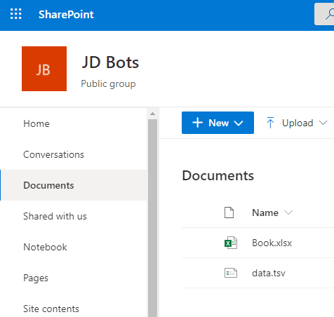
Click on Upload and choose the file.

Now, we are ready to connect to this file from Power BI Desktop.
Connect to SharePoint File from Power BI Desktop
Launch the Power BI Desktop and click on Get Data -> More.

You will see plenty of connectors to choose from. Select SharePoint Folder.

Provide the SharePoint site root URL. This can be in below format –
https://<tenant name>.sharepoint.com/sites/<site name>/
Replace the Tenant name and Site name accordingly and provide the URL for connecting Power BI Desktop to the SharePoint location. If you are logged in with the same user as that of SharePoint on the Power BI desktop, then you will not be asked to provide the SharePoint credentials. If not, a window will open to provide the creds. Select Organization and log in.

This connection will show you all the files present at the SharePoint location. Do not Load or Combine as of now, we will have to filter out to our preferred file. Click on Transform Data.

When you click on Transform Data, Power BI Desktop will open a Power Query Editor. Suppose you uploaded the Excel File to a subfolder inside the Documents folder. Then, you will have to filter based on that subfolder. To filter, open the dropdown on the Folder Path column -> Search for your folder path -> Select it and click OK.

I have uploaded my files in the Documents folder, that is why it is showing me only one path. Next, I will filter based on the file name on the Name column.

With this filter, I am left with only one row in the Query Editor. Whatever changes you make in the Query Editor, it is recorded and can be seen in the Applied Steps on the right-hand side.

Change the name of your Query to a better readable and understandable name. I have renamed it to “Financial”. Next, we are going to choose the Sheet where our data is present. If you open the Excel file, you will see that data is present in Sheet 1 in a table named “financials”. You can either choose the data based on table name or sheet name.


Click on Binary from Content Column in the Power Query Editor.

We will select the data based on the table name. The reason being, there can be multiple tables in a sheet. Click on Table opposite to financials.

This will load all the records present in the table. There are 700 rows for our Financial sample.

If your table header is coming as the first row, then Under Transform click on Use First Row as Headers.

We have made all the transformations for our data. If you want, you can change the datatypes of the column, rename the column, create a new column, and many more in the Query Editor. For now, we will Close and Apply our changes.

When your changes are applied, you will a new table added with its columns in the Fields window.

Create Report
We will create following visuals on our report –
- Sales by Month
- Sales by Product
- Sales by Country
You are free to create any other visual apart from above.
1. Sales by Month
For this, we will use a Line chart. Select Line Chart from Visualization pane.

Drag and drop below shown fields from Fields under Visualization pane.
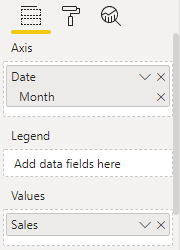
Here is the visual created. You can customize this Line chart by adding a border, increasing the font size, etc which is under Visualization pane -> Format. To do any formatting, make sure you have selected the visual.

2. Sales by Product
Click on blank space on the report. Choose a Pie chart from Visualization pane and add the following fields to it.

Here is the visual created.

3. Sales by Country
Again, click on the blank space. Choose Map from Visualization pane and add the following fields to it.

Here is the visual created. If the sales are high, the size of the bubble increases accordingly at the location.

You can arrange your report to accommodate all the 3 visuals based on your choice using dragging and aligning to your preferred format. Below is the complete report.

We are done with our report. Save the file with the .pbix extension on your local system. In the next post, we will publish this report to Power BI Service.
